Monday, October 29, 2012

Pat Steir, Edward Hopper, and Fairfield Porter

Pat Steir


Pat Steir's work is different and uses many drips. To me they look like water falls in the above painting. It seems like it would be a great stress reliever to throw paint on a huge wall. His work is the most free-spirited that I've seen, and I like that he's not afraid to make a mess! His artworks are eye catching.

The last two painters I'm going to talk about are two that I added myself.

Edward Hopper


I feel as if once I really get a good handle on painting, I'd like to be able to paint like Edward Hopper. I like how he blends his paint, but keeps it loose at the same time. I noticed a lot of his work has a lonely theme. He paints every day scenes, but with one person, or only a few people casually going about their daily lives. It looks like he captures the moment people stop to reflect on their days/ their lives. On a more practical level, I think his style might help me figure out my interior (if I choose to do an actual interior space like a room).

Fairfield Porter


For some reason, I'm getting the feeling that I have, or eventually will have, a similar style to Fairfield Porter's paintings.


I like that he is a suggestive painter. He gets the colors down, but doesn't worry about an extremely detail oriented piece. I think he definitely could if he wanted to- like in the first painting, he shows more details, but is still only suggesting them. The last painting above of the trees is extremely suggestive, but you can still obviously tell that there are different colors in the trees and there are dandelions and other flowers in the ground- even though you can't see the details of the blades of grass. I like how everything is a distinct piece, but I feel like everything blends together at the same time. I also like how his colors are muted and not extremely bright. 


April Gornik, Alexis Rockman, and Chuck Close

April Gornik


Since I'm currently painting a landscape for class, I feel like I should look at April Gornik's art and try to apply some of her themes. From what I saw, she does mostly landscapes that are detailed and realistic. While I don't want to get that detailed in my own landscape, maybe I can get inspired by the way she paints.


The fact that she is able to paint the exact colors of the ocean and the sky- I can imagine a day like this- is amazing to me. She seems very detail oriented; Nothing gets left out in this painting. Since my painting right now has a cloudy/sunset sky, I think I can try to apply her smoky clouds to my own work. Her landscapes are beautiful and well done, and you can tell they probably took a long time to do.

Alexis Rockman


Alexis Rockman's artwork reminds me of Salvador Dali's surrealism works. There is so much going on, and so much to look at and figure out. The viewer can see all of the levels of the space in the picture. For instance, you can see the the sky, the middle ground, and even underground- something you wouldn't normally be able to see. Also he provides a lot of detail that your eye probably would not be able to pick up at these types of distances. His works are intriguing to me because of the depth and the way he uses space. It's as if he's trying to tell us to remember that there is more to the Earth/area that we see in front of us. Whether that be in the ocean deep below, or the roots of a tree underground. He's telling us to not forget about that fragile part of the Earth- the part humans can't really occupy.

Chuck Close


Chuck Close is inspiring. He originally painted extremely detail oriented hyper-realistic paintings. I can't believe he paints on such a large scale and is able to show even the slightest detail of the human face. It looks just like a photograph. However, since 1988, he has been bound to a wheelchair because he was paralyzed from the neck down. He has regained some muscle control, and paints slower with the brush strapped to his wrist and on a grid system instead. Now, a lot of his ginormous paintings are done in this grid style in which every square is a different pattern. The squares still follow the color scheme of the picture though, so if viewed from a distance, the composition as a whole still makes complete sense. Therefore, the image looks as if it is made up of pixels. These works are HUGE and take such a long time to complete. He's 72 and still painting from a wheelchair! He was paralyzed! It's amazing! 


Gregory Amenoff, Camille Rose Garcia, and Alice Neel

Gregory Amenoff


What I like about Gregory Amenoff's work is that he clearly isn't afraid of using a lot of paint. Also, he uses really bright, saturated, and dark colors. I think if I can take away anything from looking at his pieces it would be to not be so afraid that I'm using too much paint at once. It would also be that I shouldn't be afraid of a little contrast. I'm not saying I'm going to use THAT much paint, or have THAT much contrast, but I have an issue with making my darker colors as dark as I want. I'm always scared I'll get too dark, so I won't have enough breathing room for lighter areas. Also, I feel like I never use enough paint; I constantly have this problem where my pencil lines show through! Anyway, his paintings seem very loose and free. And his colors appear everywhere. He sort of reminds me of Van Gogh because of his impasto and the way he blends color. I tend to have a soft spot for Van Gogh's work, so it's fitting that I like Amenoff too.

Camille Rose Garcia


All right. Hands down- I think she is the COOLEST painter on the list! Her art is like if Disney characters were were dark and twisted. Somehow everything is very cute and appealing even though it's got a Gothic/Punk thing going on. Of course this is all my opinion. I appreciate that depth doesn't matter in her case, and her characters are just cartoons floating around in a fantasy-rainbow land. Her color schemes are beautiful too. Teals, purples, pinks, oranges, light greens, the occasional sunset yellow- everything's so bright! And there's a lot of irony because her characters are so moody and strange. It reminds me of Tim Burton in a way. She probably really likes Tim Burton- I think it's safe to make that assumption. And her name is Camille. She has to be interesting with a name like Camille. 


I'm definitely going to try to recreate something of her's one day. Probably one of the animals. Her people slightly freak me out- But just look at that elephant and that spooky grinning owl up there- they're adorable!

Alice Neel


Back to portraits! People sit in chairs, and she paints them. It's like she's sketching them with paint! It's not painfully realistic, but she hits major points like the shadows and the folds of clothes. 

This one is my favorite that I saw:


It's fairly simple- or it looks fairly simple. There are definite outlines showing which I think is very interesting. His expression is so believable. I can actually imagine a guy leaning back on a chair like that in that position. Either he's thinking, he's judging you, or he's just annoyed by something. Neel's colors are very muted, and she uses a lot of yellows and browns. Also, she integrates splashes of other colors right on top. For instance, the white on his shirt has a lot of reds and blues and his skin has greens, pinks, and blues. If you think about it, we probably do have those colors somewhere on our skin, especially pink. But greens and blues could be like veins or bruises or weird shadows. Something else that catches my attention is the fact that it looks like she pays extra attention to the top half of the figure, but when it comes to the bottom half and the background, she goes faster and gets more careless. I definitely do that often when I draw people. I always just want to focus on the face- legs don't really matter to me. And backgrounds? I don't really care for them. I should work on that.

Sunday, October 28, 2012

Mark Tansey, Christian Schumann, and James Rosenquist

These next three painters are very different from one another. Of course, I'm interested in each for separate reasons.
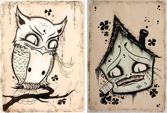

Mark Tansey


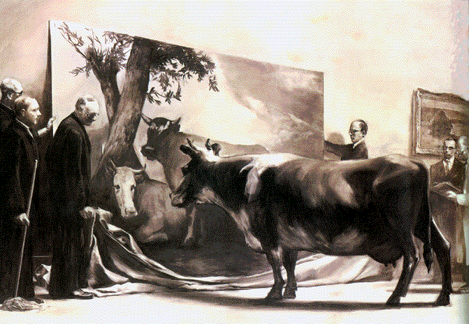
I LOVE the paintings I came across by Mark Tansey. First off, I saw the detail he uses, and I'm impressed! Eventually I would like to be able to tighten up my paintings to get to his sort of style. (I also realize I have a ways to go, but.. one day!) I like that it's not so smooth to the point where I forget it's a painting. As much as that's extremely impressive and amazing, I don't think that's what painting should be. The majority of us would probably never paint if we had to aspire to hyper-realistic approaches. I'll leave that to Chuck Close (who comes up soon in the blog, actually). Tansey definitely sets a mood easily in his paintings just because of his excessive use of monochromatic color schemes. That I can definitely relate to upon completing my own monochromatic still life. His however, seem a lot darker and moodier- whether it's an epic outdoor/historical scene or just a person in their home doing a mundane task. Here are some good examples of what I'm talking about:


I also believe that he must have had an interesting sense of humor. I think it's definitely present- especially after looking at the cow picture above. That's something I'd like to do too. It'll be sort of like a secret kind of funny. Unexpected. Mark Tansey is able to show his wit and also be an extremely awesome painter at the same time.
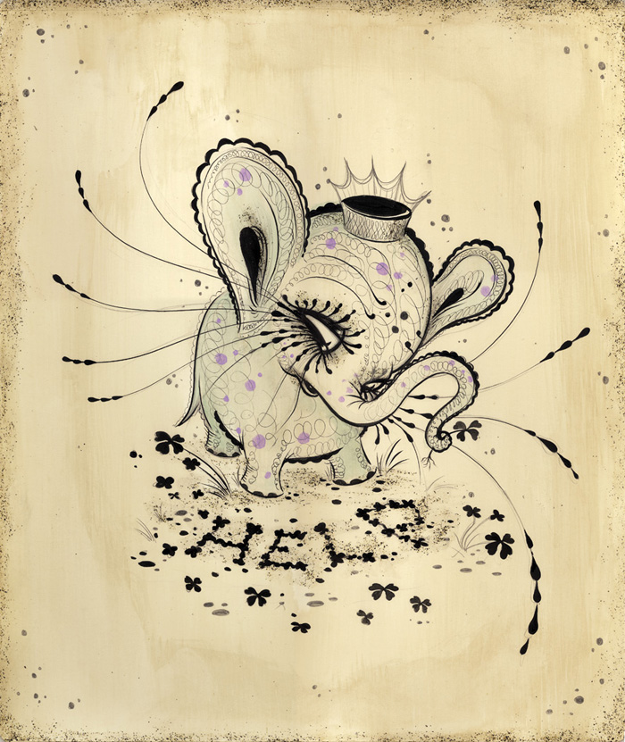

Christian Schumann


Unlike Mark Tansey, ..Nope, that's it. He's unlike Mark Tansey. At first I wasn't sure if I liked Schumann's artwork, but then after I looked at it longer, I started to feel something for it. Recently, I began looking into illustration types of art, and that's exactly what this reminds me of. Not to mention- it also reminds me of Where's Waldo- but then agan it all comes full circle because Where's Waldo is a series of illustrated picture books.


His art definitely takes me to another world.. A world full of things that don't really exist and where everything is colorful. It appears as if he puts a lot of time and effort into what he makes, and in the end it pays off. These also look a lot more like drawings than paintings, but I think that's possibly going to be a theme for me.
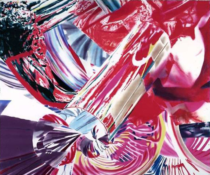

James Rosenquist


Back to the flat, one dimensional pieces! It's funny how many I've already looked at because it's not my style at all. What I find attractive about his works though is his references to pop culture and society. If I  have little inspiration, I often find myself going through pictures of my favorite celebrities, and I'll start drawing them. It helps me figure out other inspirations I might have. Something else I like, but I don't actually do, is the collage style. In a lot of his pieces that I saw, it looks like he cuts out and places separate pictures together to make one of his own. Within that, he overlaps paint strokes to make one crazy mess. Now, I don't think I can allow myself to ever make a crazy mess of a painting- not now- the only time you'll find me doing that is when I've hit that point where I'm so frustrated I paint different colored strokes of nonsenses all over the painting and get rid of it. I did that when I was younger. ..Everything always ended in finger painting.. ...Always.
 

It's almost as if it's a magazine layout that's been stretched and pulled in all sorts of directions. Or maybe it's every magazine advertisement on top of one another. Regardless, I think they're pretty cool. He keeps everything unique! The colors are loud, and the images don't have to make too much sense at first glance. I think maybe James Rosenquist is a risk taker to begin with- something I need to work on in general, and with my art.


Alex Katz, Wayne Thiebaud, and Kara Walker.

Alex Katz


When I was looking up Alex Katz's work, I was immediately attracted to the color and the portraiture. Upon further research, I found out that Katz learned painting from drawings. I definitely identify with that. I've never actually learned how to paint, so I approach it similarly to drawing. I figured everyone thought about it the same way as I do, but I was quickly proven wrong. Everyone has a different style, and they all apply the paint in different ways.

Anyway, since I was getting a little side tracked... I'm going to post a few pieces that I really like:


I really enjoy drawing faces and portraits, so these works caught my attention. The paintings look as if they are charicatures of people- they are almost realistic, but the shading and modeling is very flat. Although I don't paint in this style, I appreciate the blocks of color that were used. Personally I just like how all of these look, but I do not think I will ever paint like this. Actually, who knows..


Wayne Thiebaud


Now let's get one thing straight: I have an enormous sweet tooth. That's pretty much all it comes down to as to why I was initially attracted to all of his works. Everything looked delicious! Not to mention, I also saw some beach/Mickey Mouse thrown into his pieces, and I like all of that stuff too! It's like he knows me... But seriously though, after a further inspection of his work, I noticed that he layers his colors. For instance, in those pastel ice cream cones multiple layers of different colors are drawn on top of one another to create the form. I think it's fascinating to look at. I also like his repetition. Personally, I could probably stare at cakes and candy all day, so this is a happy medium! It reminds me of a shop display window. Also, each item is just a few shapes and lines put together. Nothing is extremely fancy or overworked- you can see all of the marks he makes. I might start drawing a lot of food after I finish this blog to be perfectly honest. 


Kara Walker


What I like about Kara Walker's style is that she paints a lot of silhouettes. I think silhouettes are fun, creative, and even though there are absolutely no inner details, just an outline filled in, there is always so much to look at. Generally, there is a story behind the dark figures- a story that the viewer needs to figure out.

 The one above is just one example of her portfolio. I noticed that her work is full of life and motion. It also has a fairytale like quality, but with a few twists. When looking at her paintings I noticed she goes back to her roots and instills an African inspired theme. That's especially unique to her, and I hope that one day I can find something that I do that is unique to me. I believe it's important and more interesting when her personal heritage and perspectives are brought into her pieces. I'd like to possibly incorporate that into my future paintings.


Wednesday, October 24, 2012

A General Disclaimer.

This is what happens when Michelle, and probably the rest of her painting class, completely forgets about her Basic Painting research assignment until a week before it's due.

DUE DATE: Thursday, November 1, 2012.

This supposedly gives me a week to do these blogs, but in reality- I have a pretty busy schedule ahead. In fact, I'm at work right now. Maybe I shouldn't be blogging, but ..school over work, right?