Mark Tansey

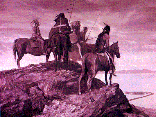
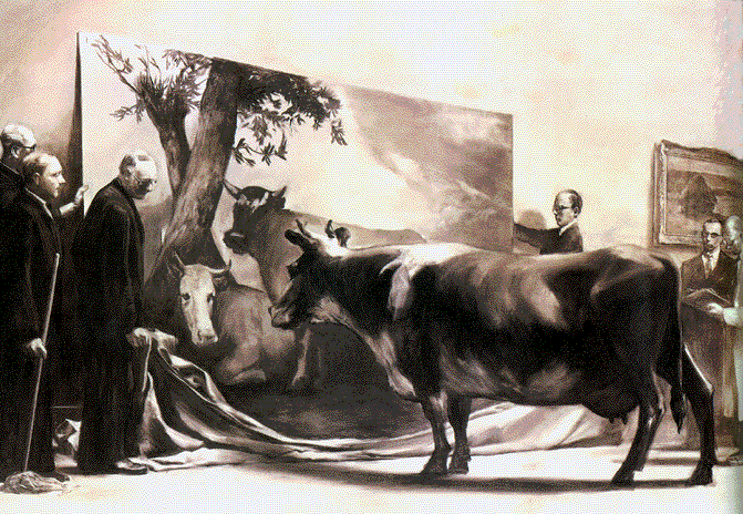
I also believe that he must have had an interesting sense of humor. I think it's definitely present- especially after looking at the cow picture above. That's something I'd like to do too. It'll be sort of like a secret kind of funny. Unexpected. Mark Tansey is able to show his wit and also be an extremely awesome painter at the same time.
Christian Schumann
Unlike Mark Tansey, ..Nope, that's it. He's unlike Mark Tansey. At first I wasn't sure if I liked Schumann's artwork, but then after I looked at it longer, I started to feel something for it. Recently, I began looking into illustration types of art, and that's exactly what this reminds me of. Not to mention- it also reminds me of Where's Waldo- but then agan it all comes full circle because Where's Waldo is a series of illustrated picture books.


His art definitely takes me to another world.. A world full of things that don't really exist and where everything is colorful. It appears as if he puts a lot of time and effort into what he makes, and in the end it pays off. These also look a lot more like drawings than paintings, but I think that's possibly going to be a theme for me.
James Rosenquist
Back to the flat, one dimensional pieces! It's funny how many I've already looked at because it's not my style at all. What I find attractive about his works though is his references to pop culture and society. If I have little inspiration, I often find myself going through pictures of my favorite celebrities, and I'll start drawing them. It helps me figure out other inspirations I might have. Something else I like, but I don't actually do, is the collage style. In a lot of his pieces that I saw, it looks like he cuts out and places separate pictures together to make one of his own. Within that, he overlaps paint strokes to make one crazy mess. Now, I don't think I can allow myself to ever make a crazy mess of a painting- not now- the only time you'll find me doing that is when I've hit that point where I'm so frustrated I paint different colored strokes of nonsenses all over the painting and get rid of it. I did that when I was younger. ..Everything always ended in finger painting.. ...Always.


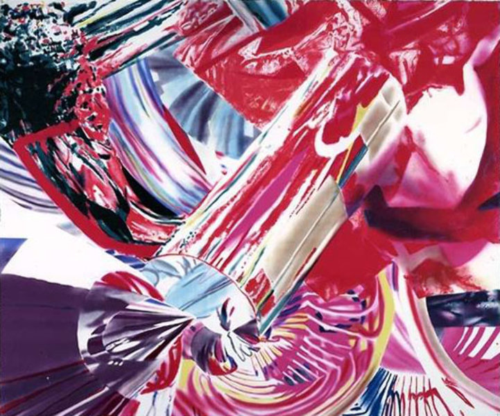
It's almost as if it's a magazine layout that's been stretched and pulled in all sorts of directions. Or maybe it's every magazine advertisement on top of one another. Regardless, I think they're pretty cool. He keeps everything unique! The colors are loud, and the images don't have to make too much sense at first glance. I think maybe James Rosenquist is a risk taker to begin with- something I need to work on in general, and with my art.
No comments:
Post a Comment