Gregory Amenoff


What I like about Gregory Amenoff's work is that he clearly isn't afraid of using a lot of paint. Also, he uses really bright, saturated, and dark colors. I think if I can take away anything from looking at his pieces it would be to not be so afraid that I'm using too much paint at once. It would also be that I shouldn't be afraid of a little contrast. I'm not saying I'm going to use THAT much paint, or have THAT much contrast, but I have an issue with making my darker colors as dark as I want. I'm always scared I'll get too dark, so I won't have enough breathing room for lighter areas. Also, I feel like I never use enough paint; I constantly have this problem where my pencil lines show through! Anyway, his paintings seem very loose and free. And his colors appear everywhere. He sort of reminds me of Van Gogh because of his impasto and the way he blends color. I tend to have a soft spot for Van Gogh's work, so it's fitting that I like Amenoff too.
Camille Rose Garcia
All right. Hands down- I think she is the COOLEST painter on the list! Her art is like if Disney characters were were dark and twisted. Somehow everything is very cute and appealing even though it's got a Gothic/Punk thing going on. Of course this is all my opinion. I appreciate that depth doesn't matter in her case, and her characters are just cartoons floating around in a fantasy-rainbow land. Her color schemes are beautiful too. Teals, purples, pinks, oranges, light greens, the occasional sunset yellow- everything's so bright! And there's a lot of irony because her characters are so moody and strange. It reminds me of Tim Burton in a way. She probably really likes Tim Burton- I think it's safe to make that assumption. And her name is Camille. She has to be interesting with a name like Camille.
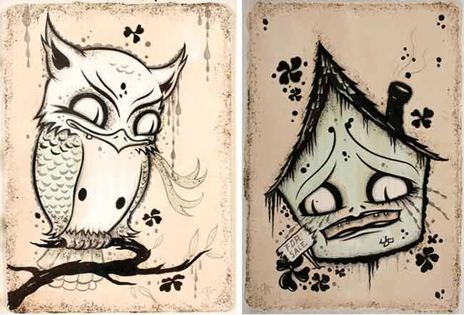

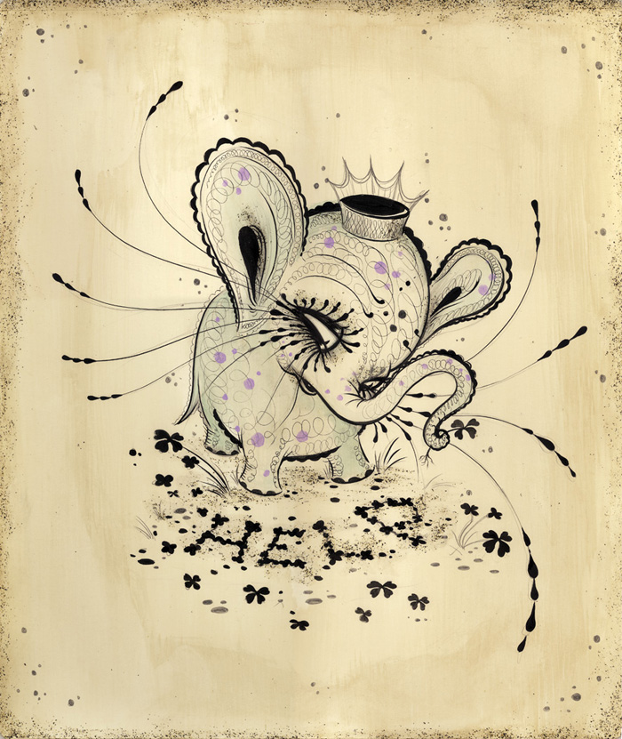

I'm definitely going to try to recreate something of her's one day. Probably one of the animals. Her people slightly freak me out- But just look at that elephant and that spooky grinning owl up there- they're adorable!
Alice Neel
Back to portraits! People sit in chairs, and she paints them. It's like she's sketching them with paint! It's not painfully realistic, but she hits major points like the shadows and the folds of clothes.
This one is my favorite that I saw:
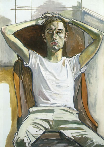
It's fairly simple- or it looks fairly simple. There are definite outlines showing which I think is very interesting. His expression is so believable. I can actually imagine a guy leaning back on a chair like that in that position. Either he's thinking, he's judging you, or he's just annoyed by something. Neel's colors are very muted, and she uses a lot of yellows and browns. Also, she integrates splashes of other colors right on top. For instance, the white on his shirt has a lot of reds and blues and his skin has greens, pinks, and blues. If you think about it, we probably do have those colors somewhere on our skin, especially pink. But greens and blues could be like veins or bruises or weird shadows. Something else that catches my attention is the fact that it looks like she pays extra attention to the top half of the figure, but when it comes to the bottom half and the background, she goes faster and gets more careless. I definitely do that often when I draw people. I always just want to focus on the face- legs don't really matter to me. And backgrounds? I don't really care for them. I should work on that.
No comments:
Post a Comment